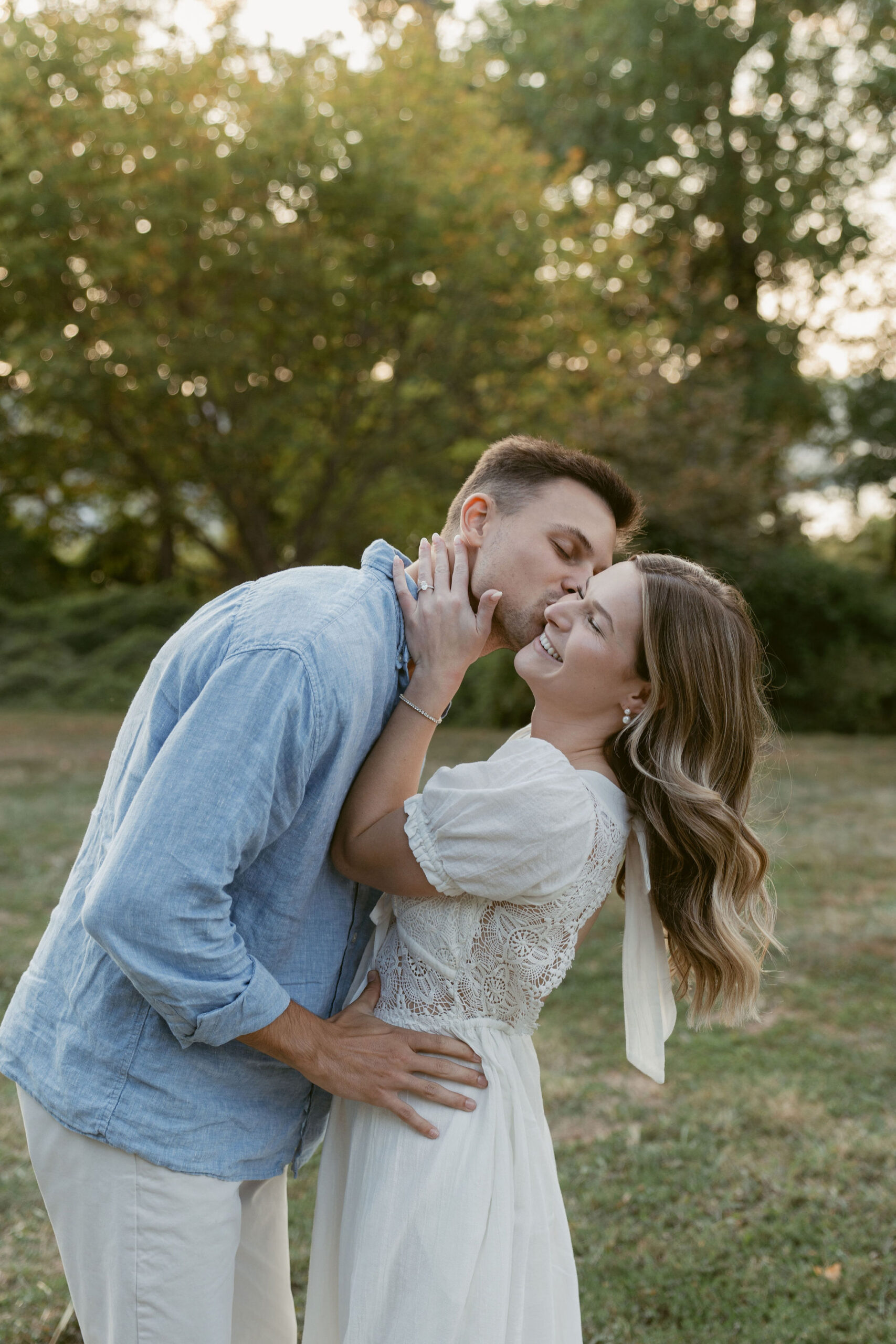
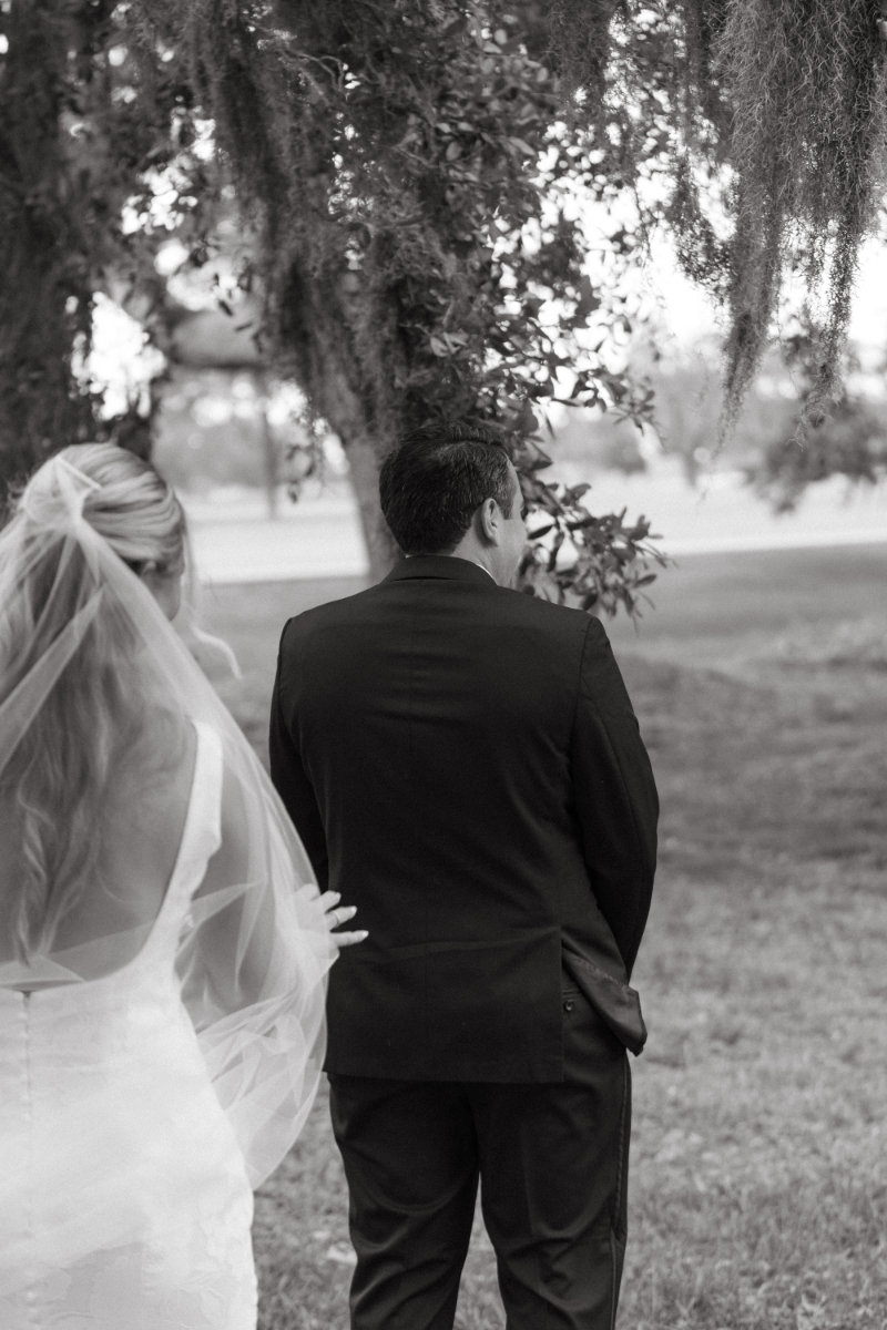
Your wedding color palette helps set the mood for your entire day. It brings your style, personality, and vision to life. Whether you’re planning a beach wedding in Greece or a chic rooftop party in the city, the colors you choose will guide everything from flowers to table settings to outfits.
A beautiful wedding color palette doesn’t just make things pretty. It helps tell your story, shows your guests what kind of experience they can expect, and, when done well, brings your whole day together in a thoughtful and timeless way.
In this post, we’re sharing our favorite tips, current trends, and real-life inspiration to help you choose your perfect wedding color palette.
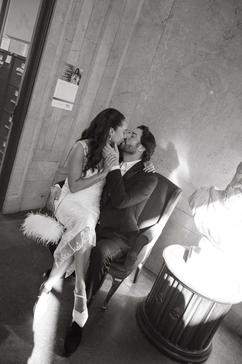
But first, if you’re planning a wedding that blends refined style with a spirit of adventure, we’d be thrilled to be part of it. We’re Maggie and Amber—the best friend duo behind Kindred Light Studios. As Cincinnati wedding photographers with over a decade of experience capturing love stories both locally and abroad, we specialize in turning real moments into timeless imagery. Whether you’re planning an intimate celebration here in Ohio or a destination wedding in a dream location like Italy or Greece, we’re here to document it all—honestly, artfully, and with heart.
Let’s make some magic together! Reach out to check our availability, learn more about our approach, or explore our portfolio for more weddings full of color, connection, and creativity.

How to Start Choosing Your Palette
Choosing your wedding color palette can feel like a big decision, but it doesn’t have to be hard. Start by thinking about what you love. What colors do you wear the most? What places inspire you? Maybe it’s the soft blues of the sea from your trip to Italy, or the warm earth tones from a hike in the desert. Your color palette can be a way to bring those memories into your wedding.
Next, think about your venue. Is it a modern space with clean lines? Or maybe a historic villa with rich textures and details? Your surroundings can help guide your choices. Let the space speak to you.
Also, keep in mind how you want your day to feel. Light and airy? Warm and cozy? Bold and playful? Your wedding color palette will help set that mood. Don’t be afraid to mix unexpected colors or add a pop of something bright.
And remember, this is your story. There are no rules. Just a chance to create something beautiful and true to you.
Trending Wedding Color Palettes for This Year
This year’s trending wedding color palettes are all about feeling fresh, bold, and full of personality. Couples are moving away from the same old soft pinks and instead choosing colors that feel modern, global, and full of life.
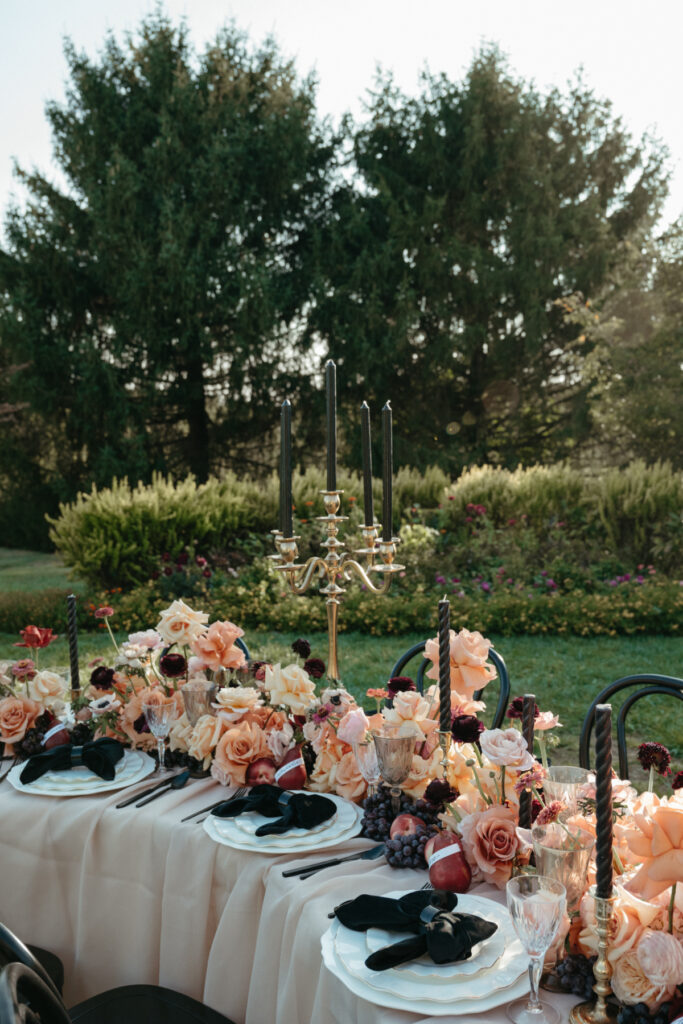
One popular trend? Rich, moody tones paired with soft neutrals. Think deep emerald green with creamy ivory, or burnt orange with soft sand. These combos feel both stylish and warm, perfect for couples who want their wedding to feel cozy but elevated.
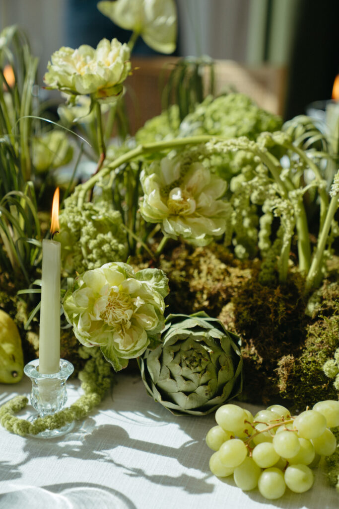
We’re also seeing a major shift toward vibrant, high-impact color. Bold greens, rich reds, and bright jewel tones like emerald, ruby, and amethyst are bringing so much depth and drama to weddings here in Cincinnati. These hues work beautifully in both classic venues and more modern spaces, and they photograph like a dream (yes, we’re biased—but it’s true!).
And of course, monochromatic palettes are still going strong. From all-white arrangements with lots of texture or a single shade carried through florals, linens, and attire, this approach always feels elegant and intentional.
The best part? You can make any trend your own. Mix, match, and layer colors in a way that feels fresh, but still you.


Seasonal Color Palette Inspiration
Let the season inspire your wedding color palette. Here’s how each one brings its own beautiful vibe:
Spring
- Soft, romantic tones
- Colors like pale pink, blush, fresh green, and buttery yellow
- Feels like blooming flowers and fresh air
- Perfect for garden weddings or elegant outdoor spaces
Summer
- Bright, bold, and full of life
- Colors like coral, turquoise, sunny gold, and tropical green
- Great for beach weddings or vibrant destination celebrations
- Adds a playful energy to your decor
Fall
- Rich, earthy, and warm
- Colors like rust, burnt orange, deep burgundy, and golden mustard
- Ideal for cozy, candlelit weddings
- Works beautifully with wood textures and moody florals
Winter
- Elegant and dramatic—or soft and cozy
- Colors like emerald green, navy, black, silver, or mulberry
- Perfect for chic indoor venues or festive winter themes
- Adds depth and style to even the simplest spaces
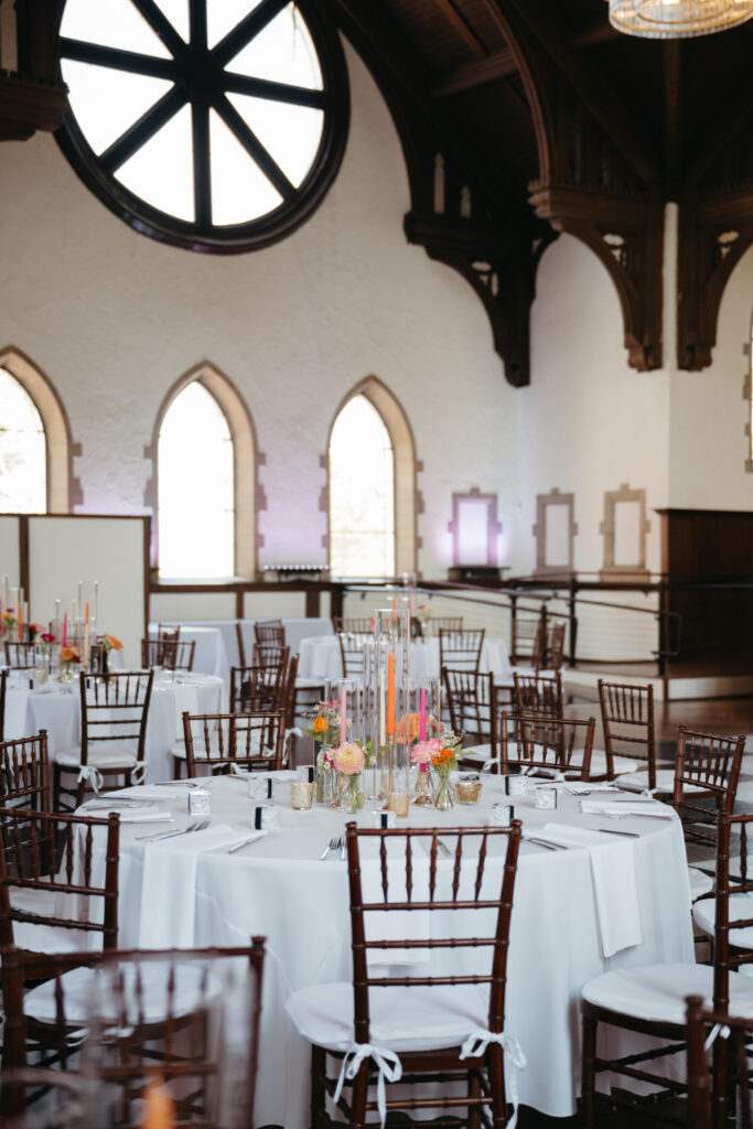
Real Weddings, Real Palettes: Our Favorites
Choosing a wedding color palette is more than just picking pretty colors, it’s about telling your unique story. Here are some real weddings we’ve photographed that beautifully showcase how thoughtful color choices can set the tone for an unforgettable day:
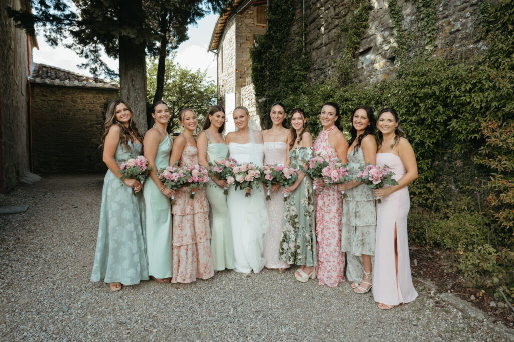
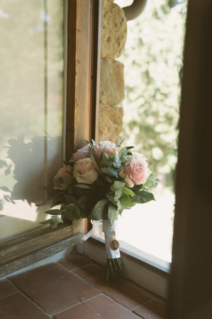
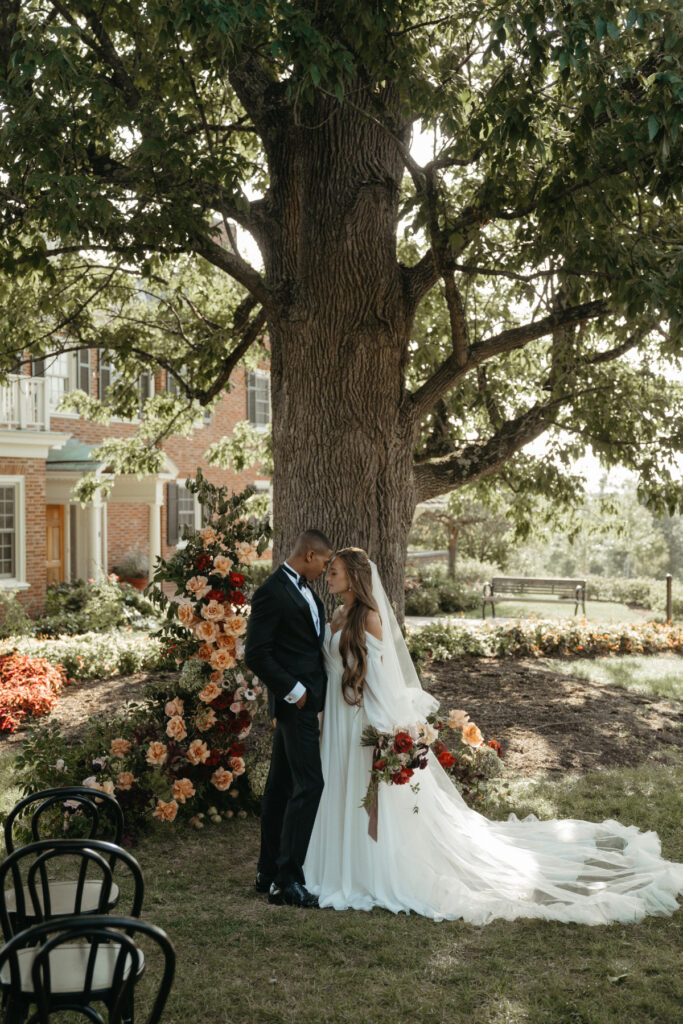
Emma & Tim at Peterloon Estate
- This spring wedding combined classic elegance with a fresh twist.
- Their palette featured soft blush, ivory, and sage green, perfectly complementing the estate’s historic charm.
- The colors flowed seamlessly from the floral arrangements to the bridesmaids’ dresses, creating a cohesive and romantic atmosphere.


Kaitlin & Grant at Glendale Lyceum
- Opting for a whimsical secret garden theme, this couple chose lavender, dusty blue, and hints of gold.
- The palette enhanced the venue’s lush greenery and historic architecture, making the day feel like a fairytale.
- From the invitations to the table settings, every detail was thoughtfully curated to reflect their vision.


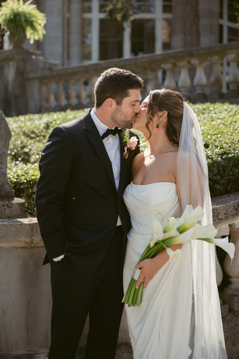
Stephanie & Aaron at Lytle Park Hotel
- Embracing modern elegance, they selected a sophisticated palette of navy, white, and metallic accents.
- The colors mirrored the hotel’s chic ambiance and provided a stunning backdrop for their celebration.
- Their choice of palette added a timeless touch to their wedding, ensuring their photos remain classic for years to come.


Emily & Greg at The Cincinnati Club
- This couple’s moody and romantic palette featured deep burgundy, soft mauve, and rich gold tones.
- The colors enhanced the venue’s vintage charm and created an intimate, cozy atmosphere.
- Their attention to detail in incorporating these hues made their wedding unique and memorable.
Each of these weddings illustrates how a well-chosen wedding color palette can elevate the entire experience, reflecting the couple’s personality and setting the tone for their special day.


Tips for Bringing Your Palette to Life
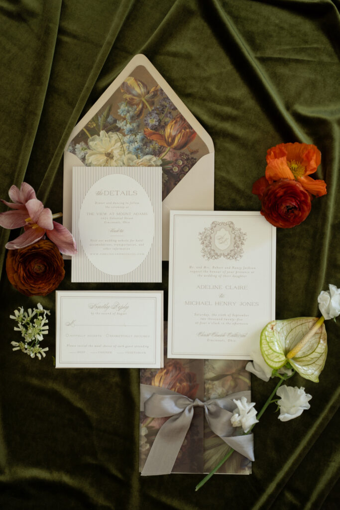
Once you’ve chosen your wedding color palette, the fun really begins! Now it’s time to bring it to life. Start by weaving your colors into your stationery. Save-the-dates and invitations are your guests’ first peek into your celebration, so let your palette shine from the start.
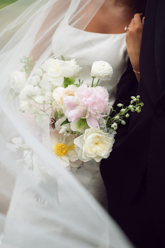
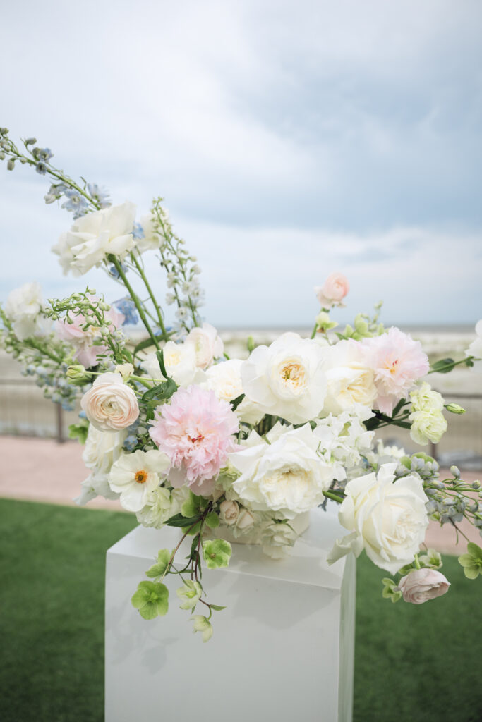
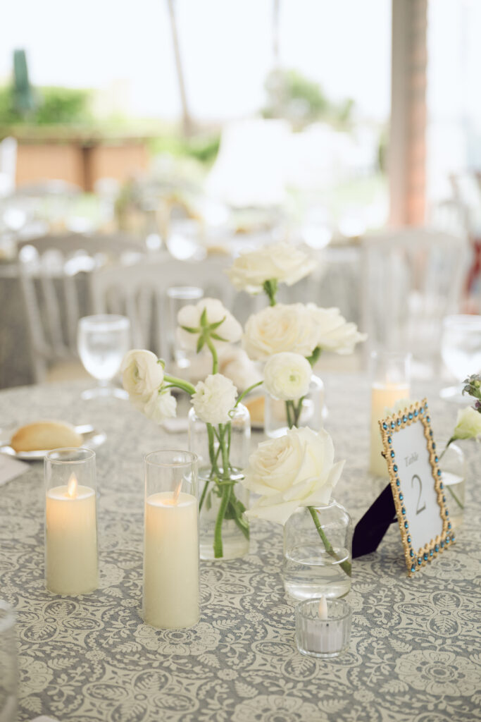
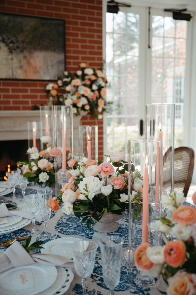
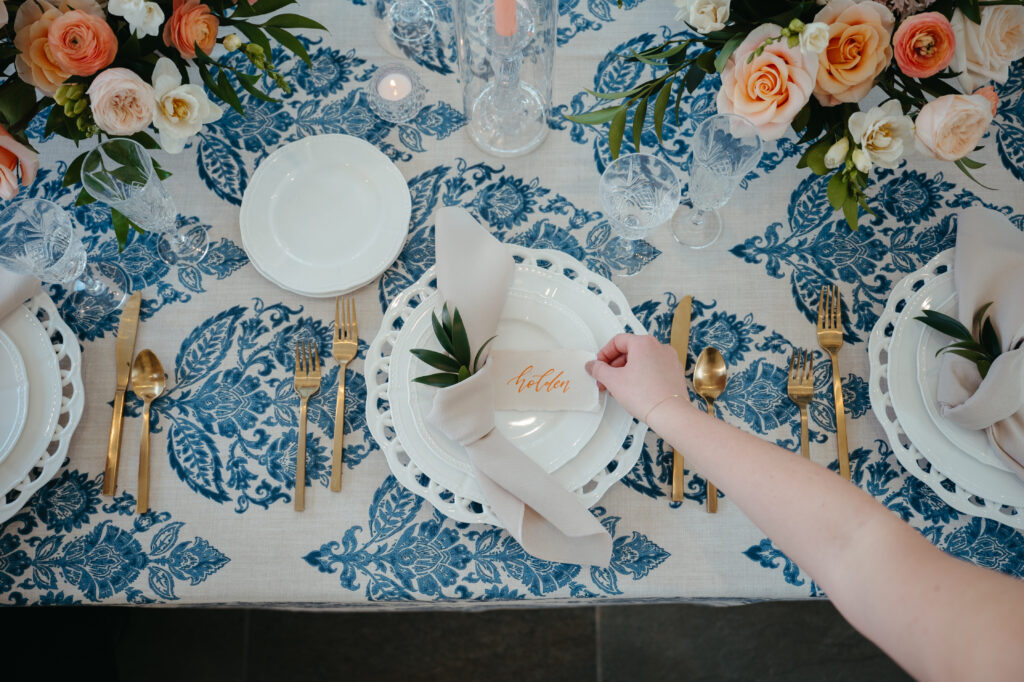
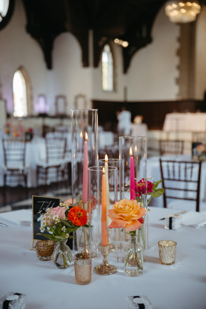
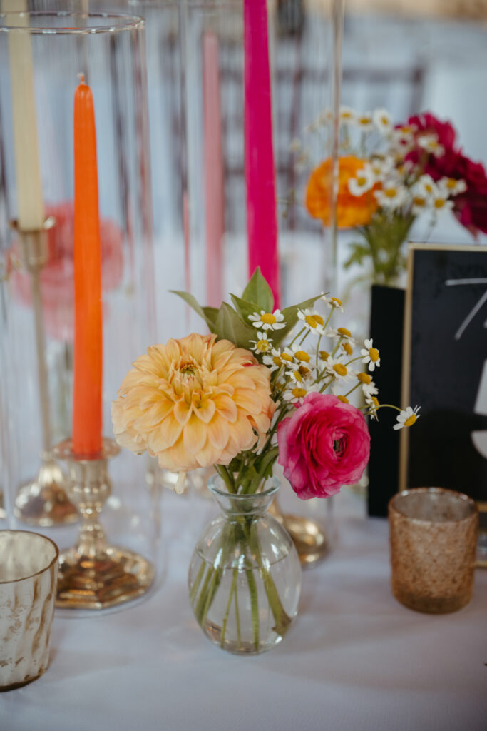
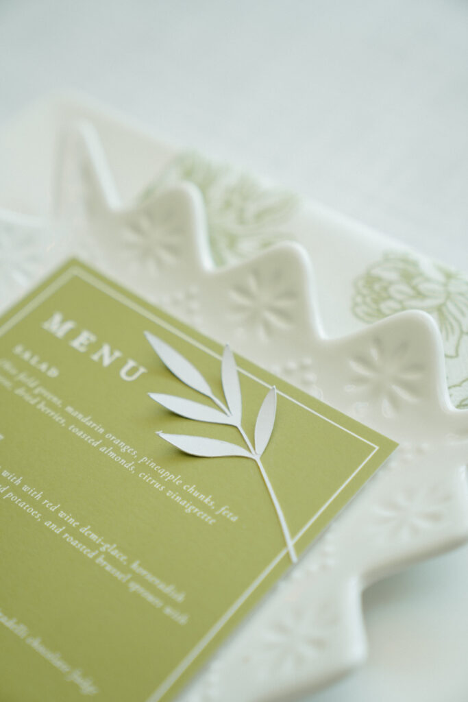
When it comes to your ceremony and reception, think about how your palette can guide the look and feel of each space. Flowers are a beautiful way to showcase your colors, but don’t stop there. Linens, tableware, candles, and even your signature cocktails can carry your palette through in subtle, stylish ways.
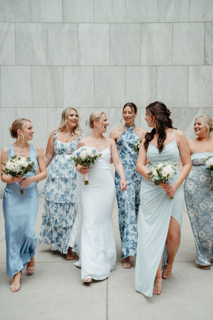
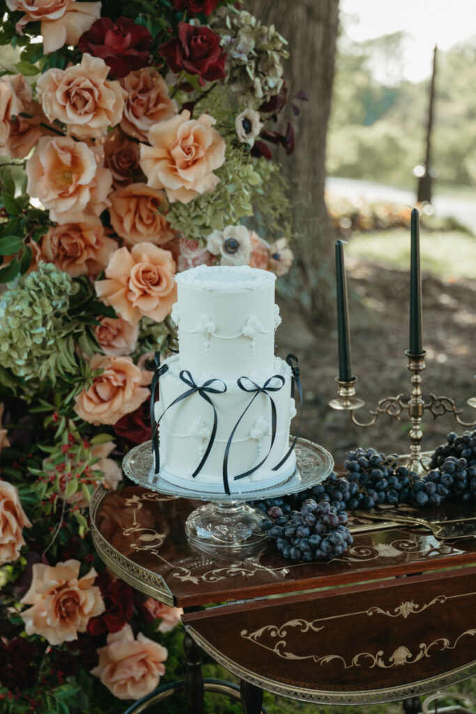
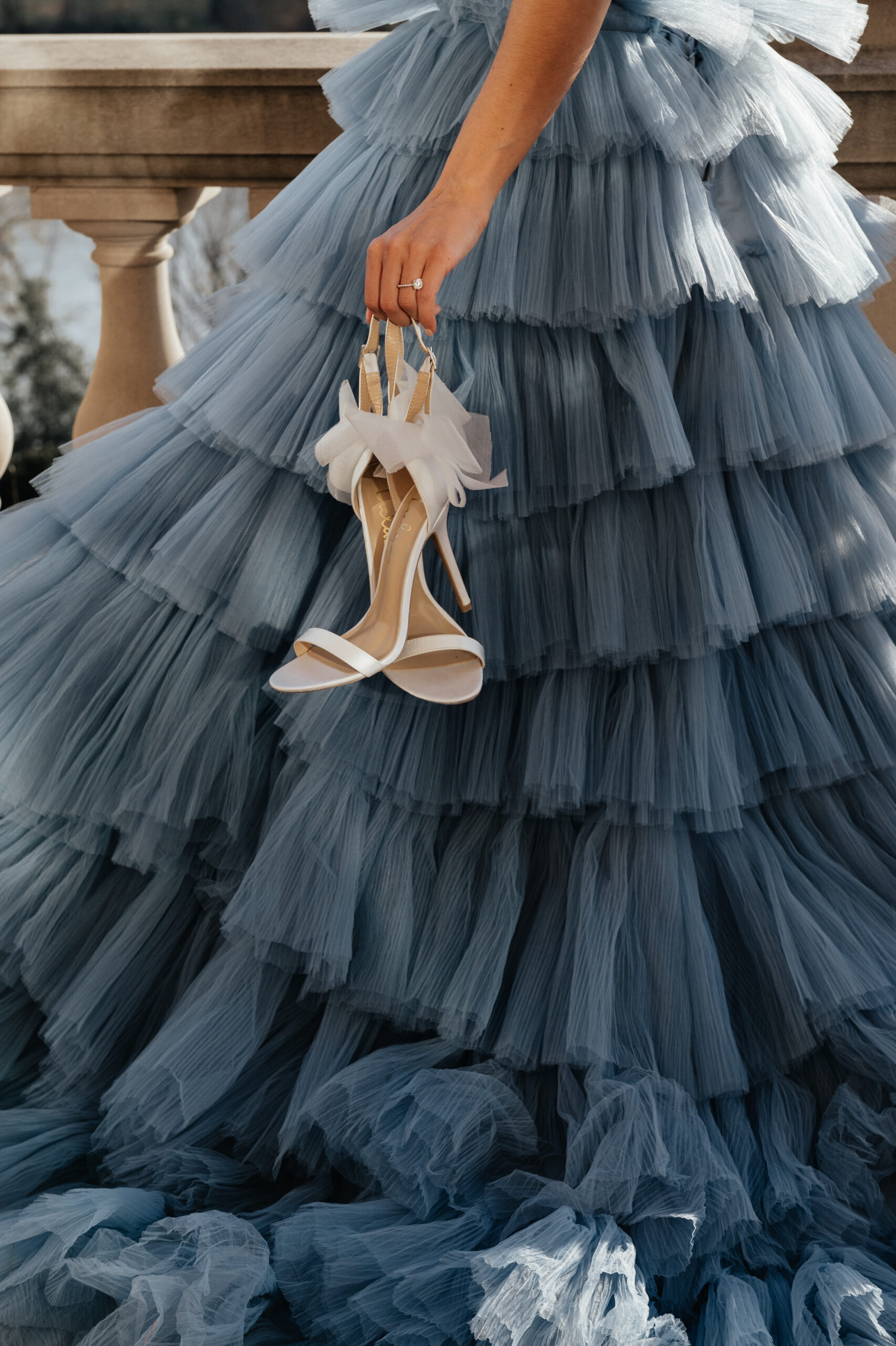
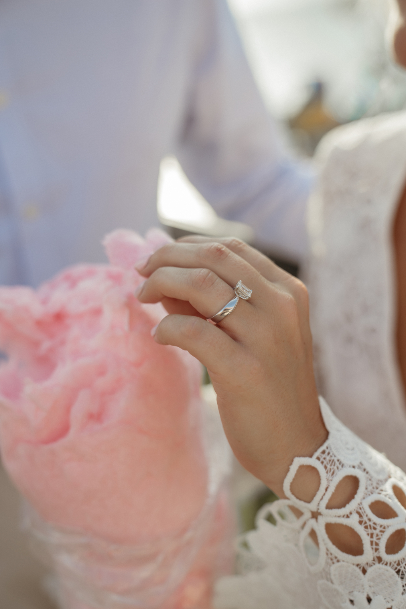
Outfits are another place to play. Bridesmaids in mixed hues, groomsmen in rich-toned suits, or accessories that tie everything together. It all adds dimension and personality. You can even work your palette into your getting-ready photos, your cake design, and your lighting choices.
The most important thing? Let your colors feel like you. Don’t be afraid to take risks, mix textures, or go with a palette that’s a little unexpected. When your wedding color palette is chosen with intention and joy, it doesn’t just look good—it feels good.
Get expert insight straight from the source! In our first Ask a Vendor series, we chat with a Cincinnati wedding planner planner, who shares her top tips and insider advice. Don’t miss Ask a Vendor: Wedding Planning Secrets from a Pro! Read it here.

Why Your Wedding Color Palette Is the Thread That Pulls It All Together
Your wedding color palette is more than just a design choice—it’s a reflection of your style, your story, and the kind of experience you want to share with the people you love most. Whether you’re dreaming of soft, romantic tones or bold, modern contrasts, the right palette will tie everything together in a way that feels effortless and uniquely yours. Trust your instincts, have fun with the process! And remember, this day is about celebrating your love, beautifully and intentionally.
We specialize in editorial-meets-documentary photography for couples who value intentional design, meaningful moments, and unforgettable experiences. If you’re curating a wedding day filled with personal touches, from your color palette to your choice of venue, we’d be honored to tell your story. We love photographing weddings right here in our hometown, but we’re also always ready to travel for destination celebrations in dreamy places like Italy, Greece, and beyond.
Let’s create something truly artful together. Reach out to connect about your wedding photography, explore our portfolio, or come say hi on Instagram!